Shape-Layer Images
Andrew GlassnerThe Imaginary Institute
7 April 2016
andrew@imaginary-institute.com
https://www.imaginary-institute.com
http://www.glassner.com
@AndrewGlassner
Imaginary Institute Tech Note #11
Introduction
Discovering new ways to experience still and moving images is entertaining and rewarding for both creators and their audiences. Here we introduce a technique I call Shape-Layer Images. The basic idea is to present an image in the form of a collection of panels, each of which is printed with shapes using single shade of partly transparent ink. Viewed independently, the panels give no hint of the image that was used to generate them. But when we look through all the panels at once, a grayscale or color image is revealed.
The pleasure of the process comes from several sources. The printing on each individual layer offers little to no clue what the final image might be. The shapes that are printed on the transparent layers can be anything: boxes, circles, logos, or any other shape (or shapes) you want to use. The shapes may be (but don't have to be) printed in a wide variety of sizes, giving the individual layers a lot of interesting internal patterns.
Depending on how the layers are presented, the final image might be only perceptible to one person at a time, granting them a kind of private audience; the image they see is visible at that moment only to them, and nobody else.
Taken together, these qualities offer a rewarding and enjoyable experience. We hope that viewers will be encouraged to contemplate how structure and meaning can arise from sources that seem, when first encountered, to be little more than chaos.
In this document we present a family of algorithms and techniques for producing these kinds of works. By using different techniques we're able to produce a wide variety of artistic styles and structures in the layers and the resulting perceived image.
Previous Work
People have used computers to create images out of collections of shapes ever since printers appeared.
One of the first examples might be the "Digital Mona Lisa," created by H. Philip Peterson at Control Data Corporation in 1965 [Peterson65]. In this project, da Vinci's famous painting was scanned, and then printed on paper with a computer-controlled printer, using only numbers. To create shades of gray, multiple numbers were overprinted repeatedly in the same location. This increased the coverage of black ink at that location, creating a darker region.
Many people have explored the idea of transforming images into collections of geometric shapes. Of course, any conventional raster image can be viewed as a tiling by rectangles. But images can be made up of other shapes, too, as discussed by Paul Haeberli [Haeberli90]. I devoted one of my columns in IEEE CG&A to my own explorations of this idea, where I processed input photographs into collections of circles, boxes, quadrilaterals, and other polygons [Glassner02]. With the rise of smartphone apps, there are now many filters that process images in similar ways. All of these techniques have one thing in common: they take an input image (often a photograph, optionally in color) and produce a new image from it.
In theater, set designers have long used the idea of painting on multiple transparent layers of fabric, and then hanging the fabrics one behind the other, so the audience is looking through them all at once. Thanks to the properties of fabric, careful lighting, and of course careful design and painting, this can produce a very convincing and ethereal sense of depth and complexity.
By processing multiple images (perhaps from a video source, or from an animation program), one can use these techniques to create animations that have the same feeling as the single-image results, but change over time.
The Core Idea
Our basic idea is to take a starting image, which we will call the input image, and from it we will produce a 3D sculpture consisting of multiple printed layers. When a viewer looks through all the layers at once, he or she will have an impression very much like looking at the original image. We call the image seen by the viewer the perceived image. It is important to note that the perceived image is never explicitly created. It isn't printed or otherwise realized as a typical image. Instead, it's a distribution of light that the viewer can see when he or she is in the right place, resulting the impression that they are looking at a version of the original image.
For simplicity, the discussion below will be in terms of single, black-and-white (or grayscale) input and perceived images. We will later discuss supporting animation and color images. We will also focus for now on drawing black rectangles that give an impression of randomness, though we'll generalize this later as well.
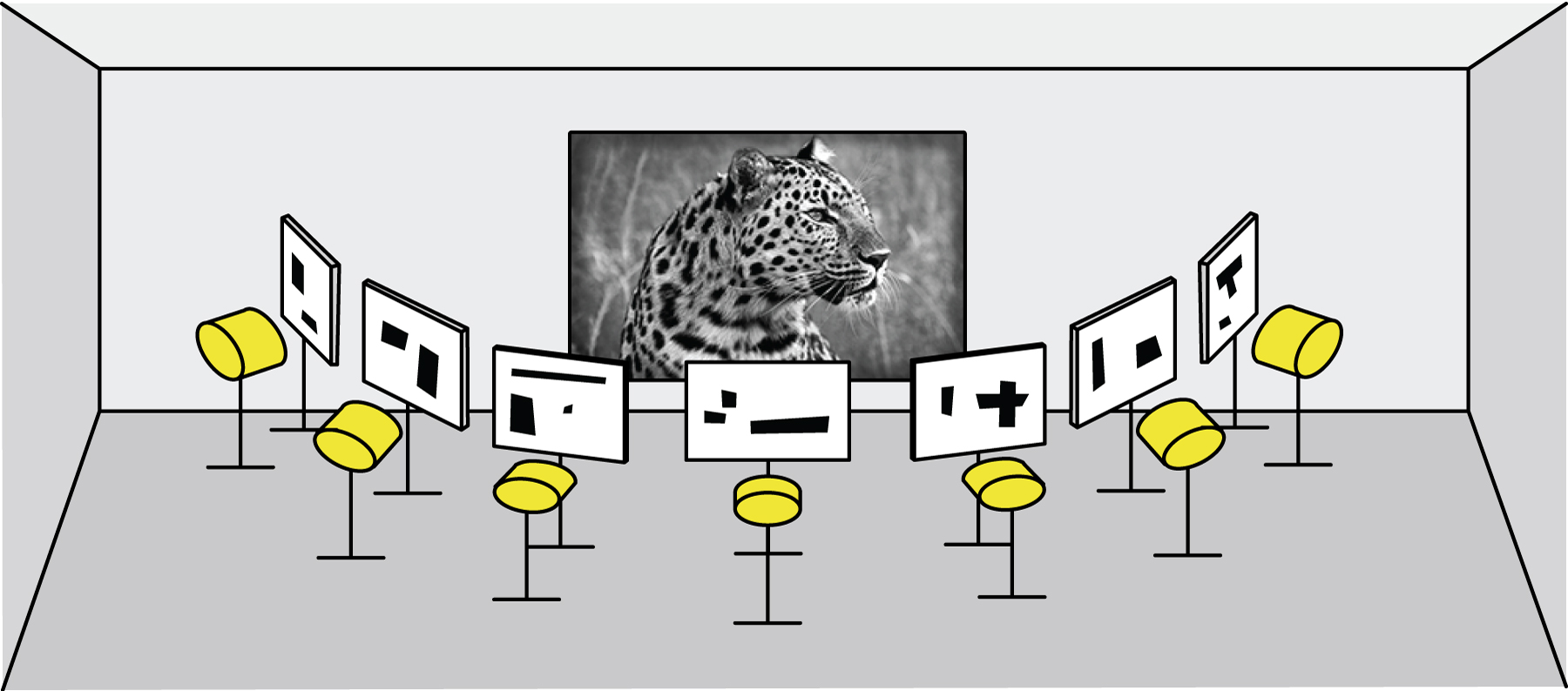
Our goal for the moment is to create a three-dimensional sculpture consisting of parallel, transparent layers with space between each layer. Each layer is printed in some places with a partly transparent ink. The same ink, at the same level of transparency, is used for all printing. In other words, the layers themselves are not grayscale: each point is either transparent, or printed with this single kind of ink. When a person first approaches the sculpture, each layer appears to be a random collection of rectangles, printed in our partly transparent ink, as shown in Figure 1. Due to practical restrictions, the figures in this document will show layers and results using opaque black, but this should be understood as a stand-in for a partly-transparent ink.
When someone stands at one end and looks down through the stack so that all the images are aligned, as in Figure 1, the person will perceive the intended grayscale image. In other words, the seemingly random jumbles of boxes, when superimposed on one another and viewed simultaneously, combine in an unexpected way to produce a coherent image.
The Physical Sculpture
We start by briefly describing the physical structure of the previous example in a bit more detail. As before, this is merely one particular way to build the sculpture. Later, we will revisit the topic and explore alternatives.
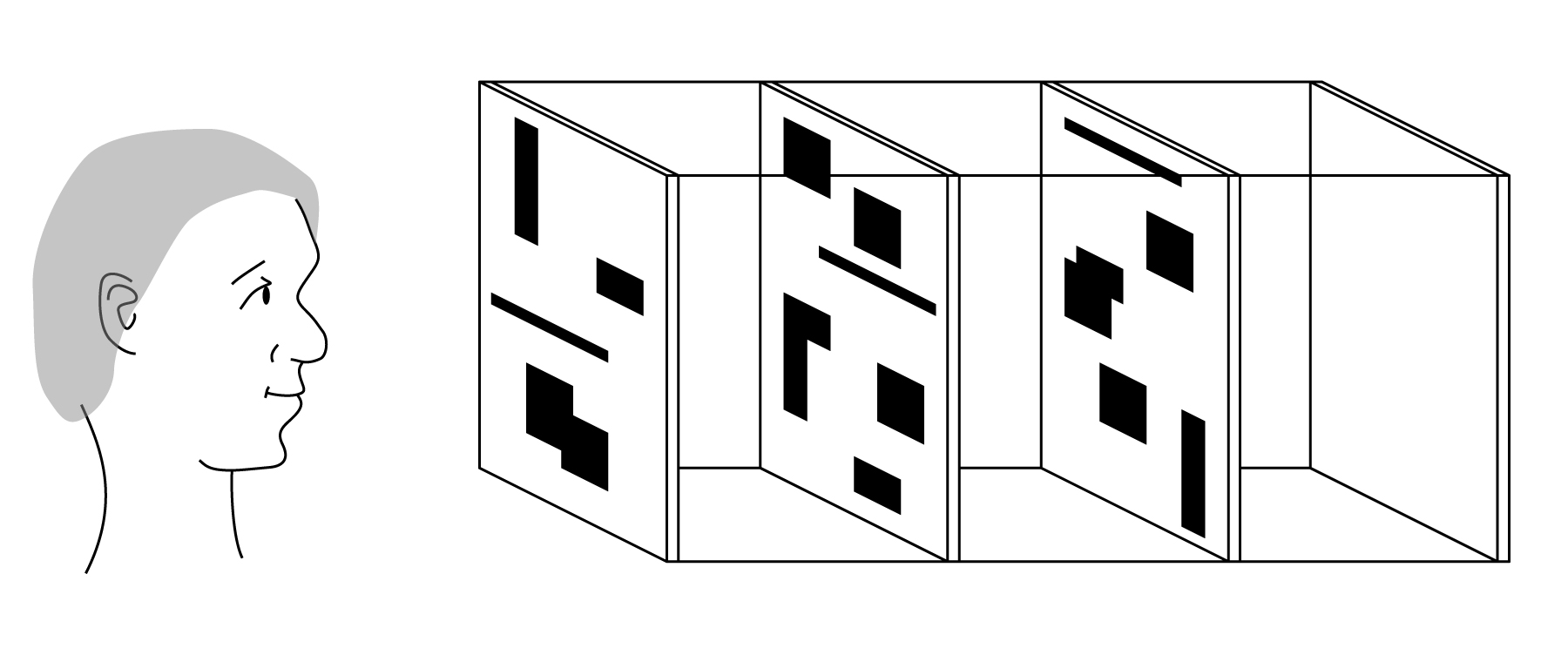
The sculpture is composed of multiple transparent layers, each made of a material such as glass, Plexiglas, or Lucite. The layers are arranged so that they are parallel to one another. For example, we might have 10 layers, each one foot on a side, each separated by a space of 2 inches from its neighbors. The layers are held together with support rods that run down the length of the sculpture, joining the corners of each layer to form a rigid structure, as shown in Figure 2. Here we show four rectangular rods connecting the layers along their edges, but one can use any mounting scheme that holds the layers in the desired positions and orientations.
This open design allows the viewer to see each layer independently as they approach the work from the side, and form the initial impression that they are covered with random collections of semi-transparent boxes, which might be overlapping.
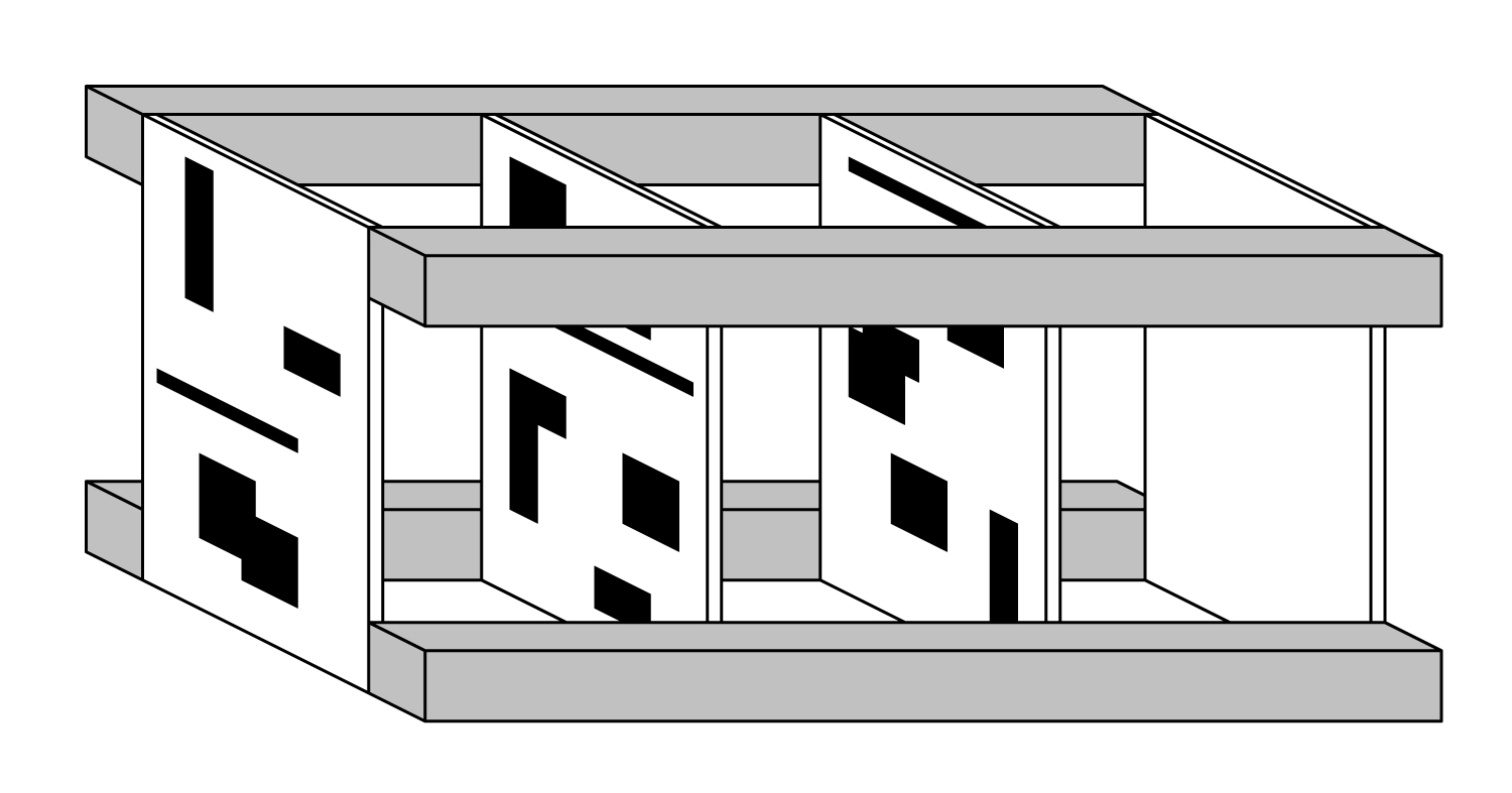
At the back of the stack of layers there is a featureless white card, evenly illuminated by a nearby light source.
Thus when a person looks down through the stack, where none of the layers have any ink, they will see the white card. When one layer has ink, the light reaching the viewer will appear as a light gray. When two layers have ink in the same location, their opacities will combine, and the card will appear to be a darker gray. In this way, we create a series of shades ranging from white to a dark gray, depending on how many printed layers the light passes through.
We note that the spacing between the layers may be dependent on the physical properties of the media used to produce the sculpture: the ink, the printing surfaces, the layers to which they're adhered (if there are any), etc. In some cases, the layers may be stacked together with no space between them at all. One approach is to produce a piece where the layers are initially separated by a convenient distance, but offer the viewer a means to adjust the space between the layers, potentially increasing that space to a large distance or decreasing it to zero.
The trick to producing a perceived image that can be as rich as a photograph is to determine which boxes should be drawn on which layers to produce the sensation of looking at the input image. We turn to that now.
Building the Layers: An Overview
We'll discuss a straightforward way to build the layers, and later we'll consider some alternatives.
To get started, we will convert the grayscale input image (which may have any number of levels of gray) into a posterized version of itself. That is, we will select a number of shades of gray, which we'll call $G$. We will then replace each pixel with an integer from $0$ to $G-1$. It will be convenient to use a numbering convention for this step that is opposite to that used in most computer graphics and image processing: $0$ means the pixel is white, and increasing numbers indicate increasing darkness. The darkest pixel in the image will be assigned the value $G-1$.
For now, we'll assign values using a linear partition of the input range. For example, suppose the input range is 0 to 255, and we want the output image to have 4 shades of gray: white, light gray, dark gray, and black. Then we partition the input range into four regions of 64 levels each, and assign to each pixel a number from 0 to 3. We save these integers in an array that has the same dimensions as the input image. We call this array uses_left (this name will make more sense later on).
Next we will create an array of data structures that are also the same size as the input image. These will hold the patterns that we will print on the layers. Writing $L$ for the number of layers, $L \geq G-1$. This is because white requires no printing, and thus no layers. So in our previous example of 4 shades of gray, a white pixel would have no ink on any layer, light gray would require printing on one layer, dark gray on two layers, and the darkest gray on three layers. So to hold our layers, we build an array of at least $G-1$ image-sized data structures. We call this array layers.
The reason I said we need "at least" $G-1$ layers is because $G-1$ is only a lower bound. If we use, say, $2G$ layers, then some of them might be only sparsely printed, or even blank, but that doesn't stop the boxes from combining properly. As we'll see, adding more layers can help hide hints of the input image that might otherwise be perceptible.
Each pixel in layers is either 0 or 1, because all printing uses the same ink. So 0 means "leave this pixel alone" on this layer, and 1 means "print this pixel".
We note in passing that we're implicitly assuming here that we can generate the impression of $G$ evenly-spaced shades of gray in the perceived image by painting between $0$ and $G-1$ layers. This assumption is not correct. It is true that the more printed layers the light passes through, the darker the perceived shade will be, but the shades will not be evenly spaced. We will return to this issue later.
Note that the uses_left structure tells us, pixel for pixel, how many layers need to be printed. In our example for $G=4$, if a given pixel has a value of 3 in uses_left, then we will mark with a 1 all three of the corresponding pixels in layers. If the pixel has a value of 2, then we'll mark only 2 of the entries in layers.
A critical point to note is that it doesn't matter which two layers we choose to mark. The viewer will ultimately look down through all the layers, and will see a shade of gray corresponding to the number of layers that have ink on them. It doesn't matter which layers are marked and which are not; when stacked, all that matters is how many are marked. We will later use this to our advantage.
We are now ready to produce a set of layers for a sculpture. To start, I will present a simple version that lets us see the key ideas. This simple version will not produce the results we want, so we'll then present some variations that will greatly improve the output. I'll use a python-esque pseudo-code.
Algorithm 1
# Initialize
1.  layers = array of G-1 grids, each with same dimensions as input image, all elements set to 0.
2.  uses_left = array with same dimensions as input image
3.  foreach (x,y) in input_image
4.    uses_left[x,y] = integer in [0, G) where 0 = lightest original pixel, G-1 = darkest
# Scan and mark
5.  foreach (x,y) in input_image
6.    if uses_left[x,y] > 0
7.      foreach layer_number in [0, uses_left[x,y]]
8         layers[layer_number][x,y] = 1
# Save layers
9.  save each layer in an image file
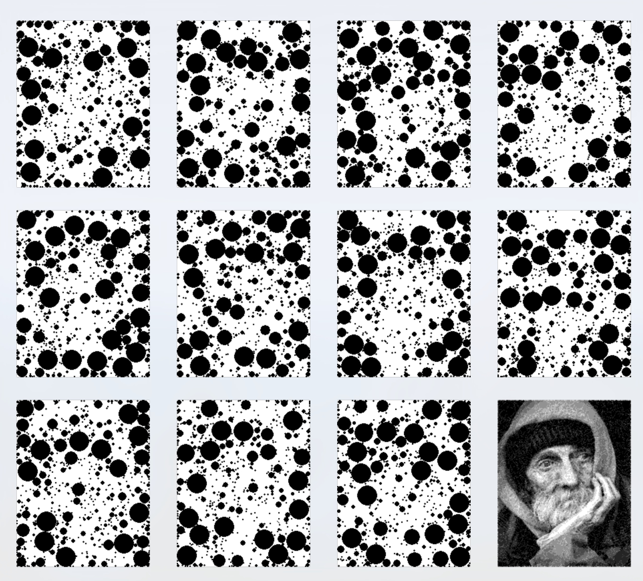
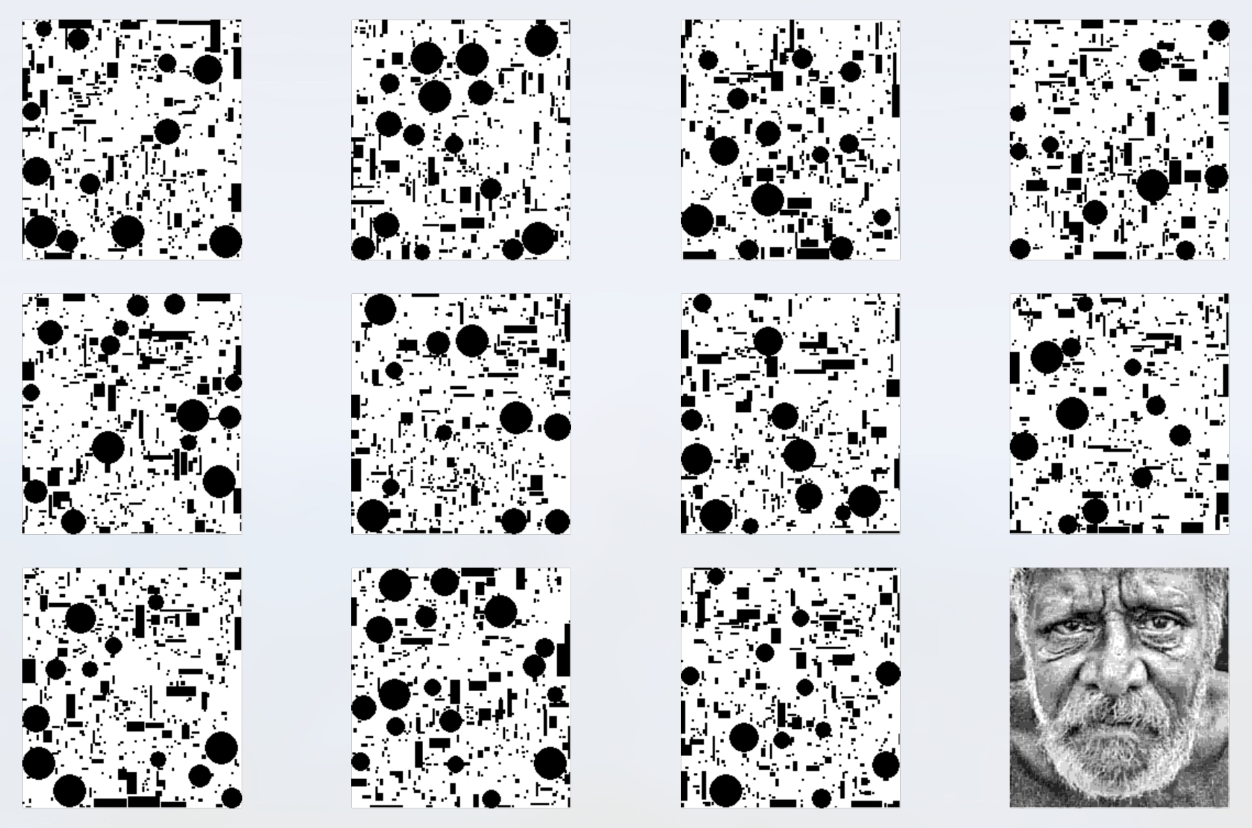
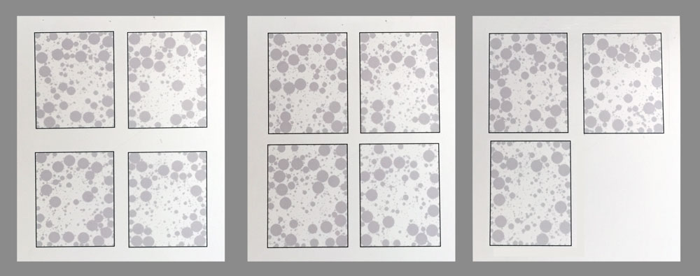
Let's see an example of this algorithm. Our input image will be a grayscale painting, with resolution 200 by 142, and 256 layers of gray, shown in Figure 3.
In this figure, as in all similar figures that follow, we first present the layers starting at the upper-left and then working right and down. The rightmost image on the bottom row shows the perceived image, which we find by summing together all of the layers (again, the layers are shown in black here for clarity of presentation, but when we sum them together we use the partly-opaque version that would actually be printed). Thus the grayscale image in the bottom-right will always show the perceived image, which results from looking through the stack of the other layers in their partly-transparent form.
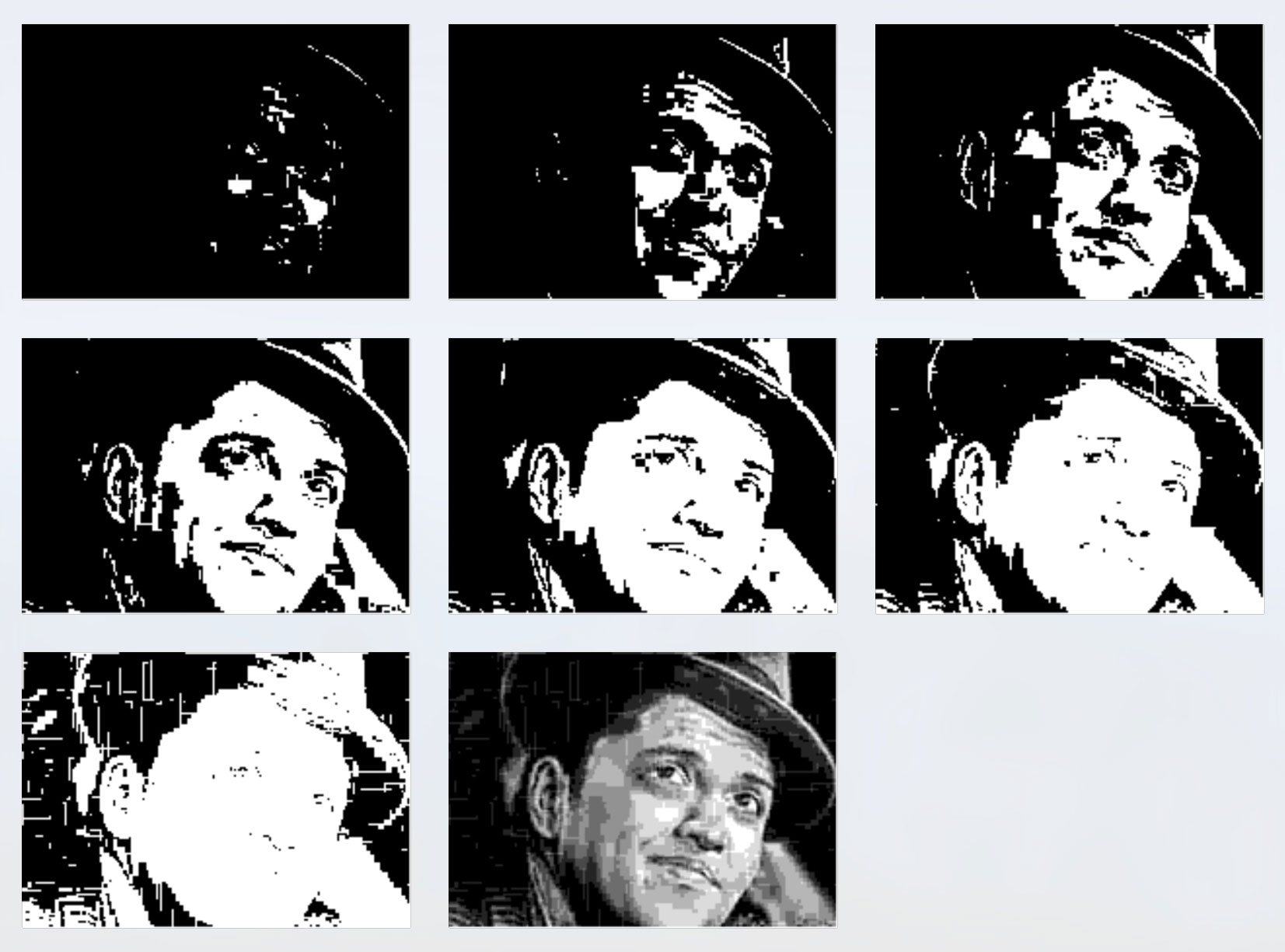
Unfortunately, the layers in Figure 3 easily reveal the final image, which both ruins the surprise and weakens the artistic statement we're trying to make. The problem is that coherent structures in the input (such as the hat, eyes, nose, etc.) are appearing as similarly-shaped coherent structures in the output.
Algorithm 2
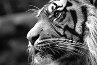
To reduce the influence of the structures in Figure 3, we can try painting the layers randomly. We need only modify step 7 of Algorithm 1.
5.  foreach (x,y) in input_image
6.    if uses_left[x,y] > 0
7a.     layer_order = shuffle(range(0, num_layers))
7b.     foreach index in [0, uses_left[x,y]]
7c.       layer_number = layer_order[layer_index]
8         layers[layer_number][x,y] = 1
In words, we make a list of the integers $0$ to $G-1$, and shuffle the entries of the list into random order. Now we fill in the same number of layers as before, but instead of painting the first few layers we paint the same number of layers in random order.
Example results are in Figure 5.
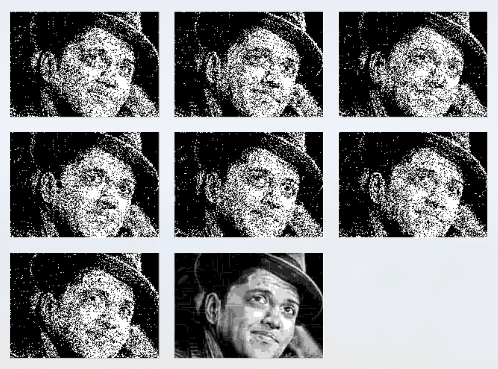
The structures are indeed diffused, but they're more obvious than ever, and are easily visible on every layer, though now with a speckled, or noisy, appearance. We seem to have taken a step backwards.
The good news is that we can combine ideas from these two extremes to develop a better algorithm. We want to find a "sweet spot" between randomness and uniform structure, providing both a pleasing sense of internal tension (from apparent chaos) and harmony (from regular structure). In other words, we want the individual layers of the sculpture to have easily perceived but not entirely regular structures which are unrelated to the structure of the final image. This will take a little more work.
Building Layer Structure
The trick to creating structure in the layers that is different than the structure in the input image is to consider multiple pixels at once. If we can find a coherent group of pixels that all need to be painted, and they can all be painted on a single layer, then that shape might be perceived on that layer by the viewer. If there are enough of these shapes, then the viewer might only recognize the shapes and their patterns, and not see any hints of the input or perceived images.
Let's take rectangles as our example for this discussion. Suppose that we are able to find a rectangle of pixels that all need to painted, and they can all be printed on a single layer (that is, none of the pixels in that rectangle on that layer have already been painted). When a viewer looks at that layer by itself, he or she stands a good chance of perceiving that rectangle, and therefore attributing that structure to that layer. If we can paint all the layers this way, then a person approaching the sculpture from the side will perceive a bunch of layers that seem to be covered with random boxes. Looking down the layers, the boxes will overlap pixel-by-pixel to produce the perceived image, which may have no box-like elements at all.
As the layers get filled, it will get harder and harder to find large empty rectangles that can be entirely painted on a single layer. But because we want our boxes to be easily recognized by the viewer, we still want them to be as large as possible, and as contiguous as possible (that is, reducing the amount of noise as in Figure 5). Our compromise will be to find the largest rectangle that can be painted using pixels considering all the layers simultaneously, and then take the layers in a random order, painting as many of the remaining pixels as we can (since we can only paint into locations on that layer that have not yet been painted). We know that by the time we've examined every layer, every pixel in the rectangle will have been painted.
To write this algorithm, we will continue to use the uses_left data structure from above, but our approach will be to iteratively search it for the largest box that has all non-zero entries. We'll "draw" as many pixels as possible from that box into the first layer by considering each pixel in turn. If the entry in layers for that pixel for that layer is 0, we set that entry to 1 and remove that pixel from the box, so it's not drawn again. When we've tested every pixel for this box in this layer, we may find that some pixels were not drawn, because the layer already had a 1 in those locations. So we consider the next layer, and repeat the process, attempting to paint as many of the remaining pixels as we can. We continue repeating until we've painted all the pixels or we've examined every layer.
Because the box was only made up of pixels that had non-zero entries in uses_left, we're guaranteed that every pixel can be written to some layer. When there are no more remaining pixels to be drawn, we subtract 1 from every entry in uses_left that's within the box. Now we can see the reason for the name uses_left: this is how many "uses", or layers to be painted, each pixel requires. When we've painted every pixel in the rectangle, we've reduced its number of "uses", or required paintings, by 1. When that number reaches 0, that pixel should not be painted onto any more layers.
In other words, each rectangle consumes only one "use" from uses_left. Any remaining uses are left to be consumed by subsequent rectangles.
Figure 6 shows this process graphically. We start with a rectangle (in red on the left), and sequentially write its pixels to each layer. Pixels in the box that are already set to 1 in each layer (shown in gray) cannot be written to again, so those pixels are carried along and we attempt to write them to the next layer. Most layers will usually take at least some pixels, but no matter how they land, we are guaranteed by construction that every pixel in the box can be written to at least one layer by the time we've examined them all.

So at the conclusion of the one step shown in Figure 6, the value of uses_left for every pixel in the red rectangle will be 1 less than it was at the start of that step. Some values may go to 0, while others will still be positive, and may be used as part of other boxes which will be processed in the same fashion.
To prevent the sorts of effects in Figure 4, where the layers were written to in order, each new box uses a new, randomized ordering of the layers.
When we've finished drawing the pixels (and updating layers and uses_left), we repeat the process again. We find the next largest box, "draw" that new box into a new random ordering of the layers, updating layers and uses_left accordingly, and then repeat again, until the largest remaining box is smaller than some predetermined size.
For this discussion, we'll consider the size of a box to be equal to its area (other measures are possible, such as the length of its largest side).
To prevent any giant-sized boxes from dominating any layer, we'll impose a maximum area. And to prevent a scattering of tiny "dust", we'll also impose a minimum area.
Algorithm 3 below presents pseudo-code that implements the algorithm we just presented in words.
Algorithm 3
Algorithm 3 offers a pseudo-code listing to implement the strategy we just discussed. Note that in this form, the algorithm is very inefficient: after drawing each box, we scan the entire image from scratch, finding the size of every largest box at every pixel (most of which will be the same as they were the last time through the loop), only to ignore all of those results except for one box with the largest area. For clarity, this pseudo-code doesn't explicitly detect and resolve ties, but in each case when there are multiple candidates for the box with the largest area, we choose one randomly.
# Initialize
 1.  wid, hgt = input_image size
 2.  layers = array num_layers long, each element (wid x hgt), init to all 0
 3.  largest_box = array (wid x hgt), each entry holds (area, lrx, lry), init to all 0
 4.  uses_left = array (wid x hgt), init to all 0
 5.  foreach (x,y) in input_image
 6.    uses_left = integer in [0, G) where 0 = lightest original pixel, G-1 = darkest
# Top of the main loop: find and save the largest box for each pixel
 7.  foreach (ulx,uly) in input_image
# Search all possible boxes using (ulx,uly) as upper left
 8     largest_area = 0
 9.    largest_lrx, largest_lry = 0
10.    foreach box_wid in range of minimum to maximum box size
11.      foreach box_hgt in range of minimum to maximum box size
12.        lrx = ulx + box_wid
13.        lry = uly + box_hgt
# Test to see if this box can be drawn
14.        foreach pixel in the box, check uses_left. If all values are > 0
# Save this box if it's the largest one so far (break ties randomly)
15.          area = (lry-uly) * (lrx-ulx)
16.          if area > largest_area
17.            save area, lrx, and lry in this pixel of largest_box
18.            largest_area = area
# Find the biggest box available anywhere
19.    biggest_box = entry with largest area in largest_box (break ties randomly)
# Save the layers and quit if the largest box is too small
20.    if biggest_box.area < minimum_box_area
21.      exit the loop, resuming with step 30
# Draw the box's pixels
22.    bitmap = a bitmap (wid x hgt), all 0 except 1 in the box from (ulx,uly) to (lrx,lry)
23.    layer_order = list of integers from 0 to num_layers, in random order
24.    foreach layer_number in layer_order
25.      foreach pixel (x,y) in bitmap with value 1
26.        if layers[layer_number][x,y] == 0
27.          layers[layer_number][x,y] = 1
28.          bitmap[x,y] = 0
29.          uses_left[x,y] -= 1
# Save the layers to the drive
30.  save the layers to disk and exit the program
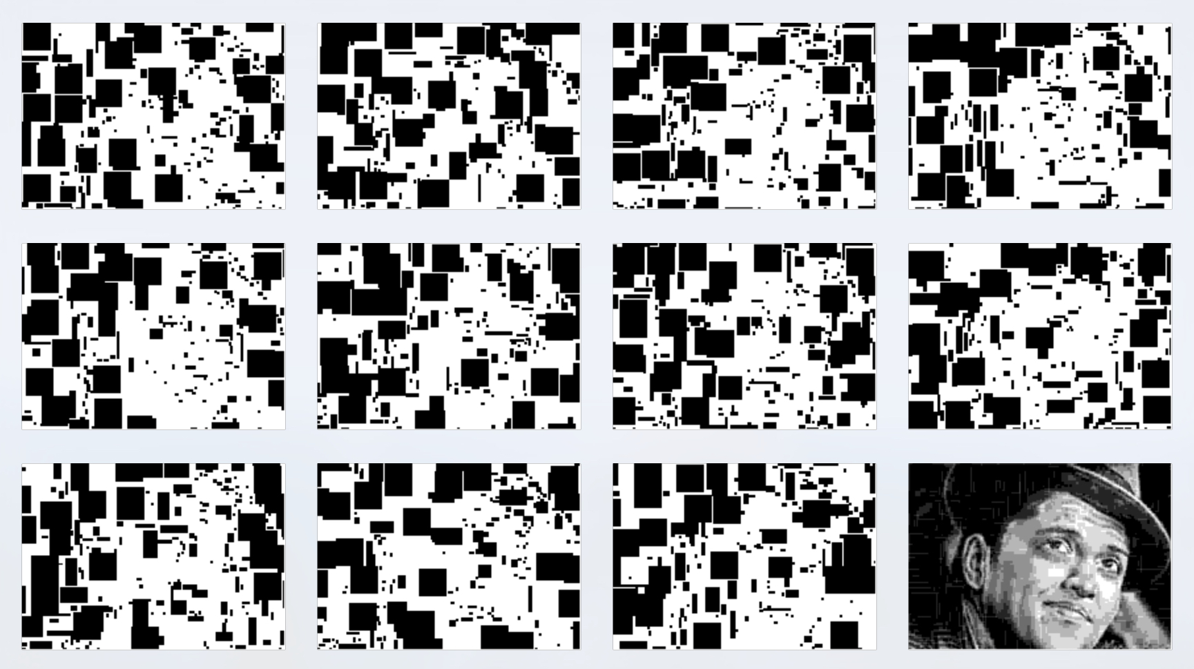
Figure 7 shows the results of this algorithm, where we used 8 levels of gray and the minimum 7 layers ($G=8, L=7$). Notice that the input image is still easily recognizable in the layers, so this isn't an acceptable result.
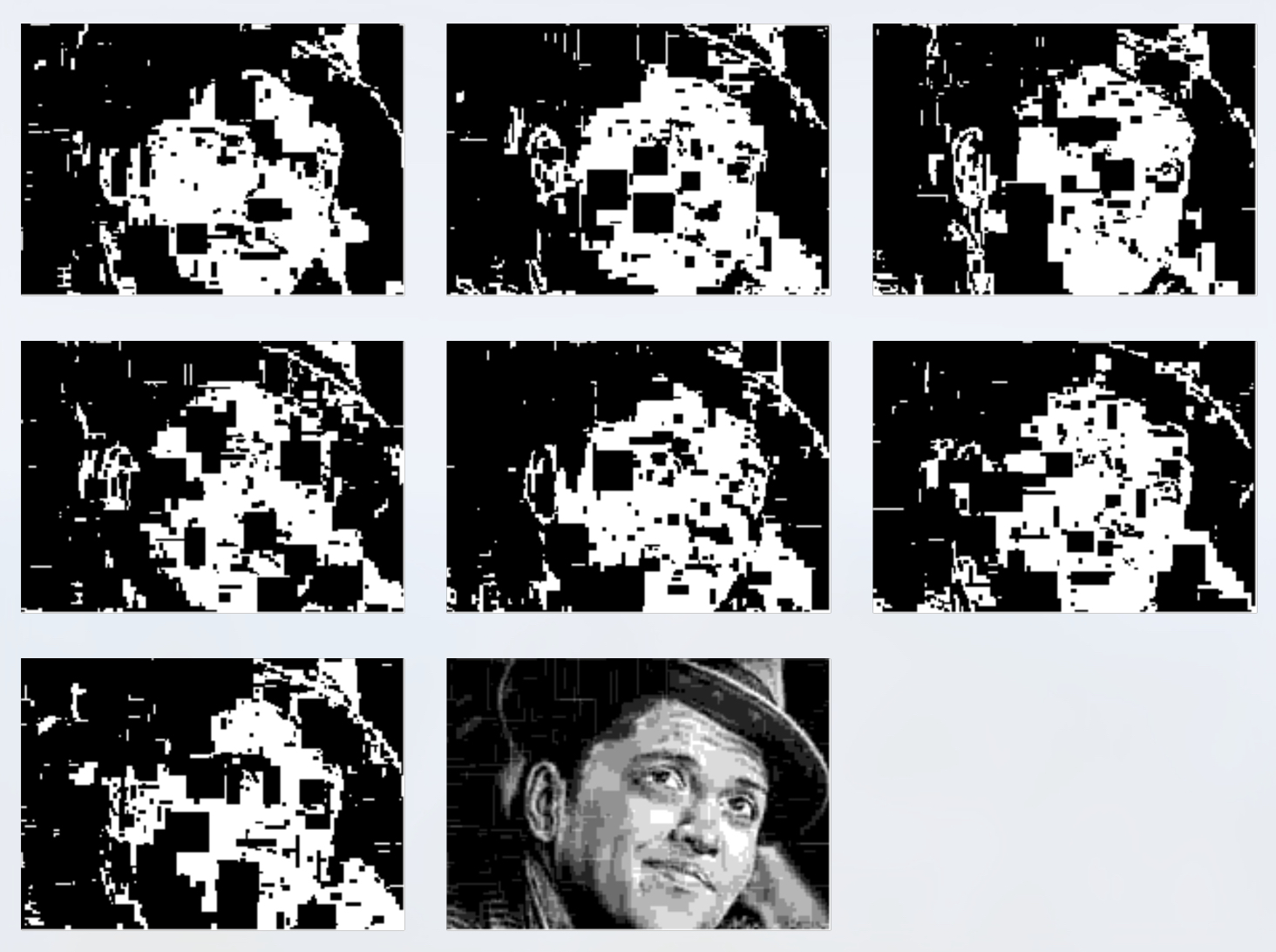
We can improve these results dramatically by simply using a few more layers.
In Figure 8, we applied the same quantization to 8 levels of gray, but now we used 11 output layers ($G=8, L=11$). Compared to Figure 7, each layer is a little sparser, and it is harder to see the input image in the layers. Generally speaking, adding layers will increase the diffusion of the input image, making it harder and harder to spot in the layers.

Knowing the input image, you may see hints of it in the layers of Figure 8 (particularly the layer in the bottom-left). Part of this is due to well-known properties of the human visual system that makes it incredibly good at finding and extracting faces (there are many photographs of everyday things such as houses, electrical equipment, water stains, and even rocks on Mars that seem to jump out at a viewer as being a "face," sometimes of a recognizable person or celebrity). If desired, we could gradually increase the number of layers until those hints are gone, or stop the process before the final stages (where the smallest boxes are drawn) to remove those details that seem to contribute a lot to revealing the facial features.
The key insight behind Figure 8 is the fact that it doesn't matter into which layers the pixels are drawn. So the algorithm takes the layers in a new random order for each rectangle, and tries to draw as many pixels of that rectangle as possible into each one. By construction, we're guaranteed that we will always be able to draw all of the pixels in the box.
Note that if we set the minimum box size to a value greater than 1, there may well be non-zero entries in uses_left by the time we're done. This is in fact the most usual case. If we were willing to draw boxes as small as a single pixel, then we could completely draw every "use" of every pixel, and uses_left would be entirely zero. Thus we can consider the contents of uses_left at the end of the process to be a kind of "score" for the quality of the match of the perceived image to the input image. The maximum value in uses_left is the largest absolute error for any pixel, and the number of non-zero entries tells us how many pixels will appear to have the wrong shade of gray. We can use this information to address any exceptional problems. We will return to this subject later; for now, we will just presume that any such discrepancies are acceptable.
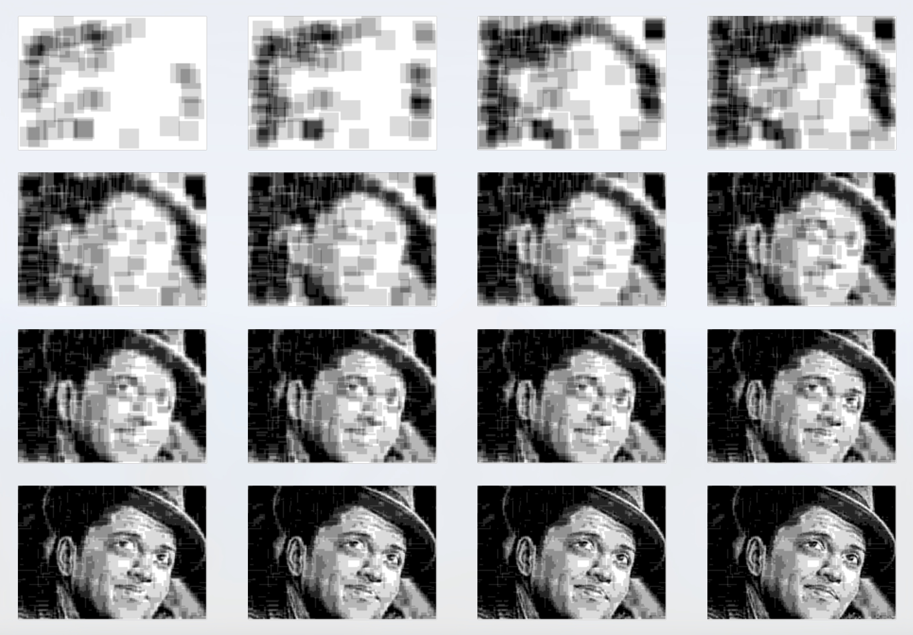
It's interesting to look at the results partway through the process, so we can see how the perceived image is slowly built up over time. Figure 9 shows the perceived image of Figure 8 at several steps along the way through Algorithm 3. Because we draw the largest boxes first, we can think of the early results as kind of low-resolution versions of the input image.
Improving Efficiency
Algorithm 3 produces attractive results, but it's very inefficient. For example, the input image we've been using so far is an 8-bit grayscale image, with dimensions 200 by 142, containing 28400 pixels. Each time we search for a box we examine an enormous number of pixels, and for each pixel we test a large number of boxes. Figure 8 required a bit more than 28 hours to produce (this is clock time measured on my late-2014, 3.5 GHz Apple iMac, running unoptimized Python code in debug mode and with no parallel acceleration, but it gives a rough feeling for the expense of the computation).
There are many ways to improve the efficiency. We could of course redesign the whole algorithm, or we could apply speedup methods to what we have. Let's follow the latter course.
Huge improvements can be found with just two changes. First, cache the biggest box found for each pixel. We save that in a data structure called largest_box. Each time we start the search for a new box, we simply search that saved data for the box with the largest area, and then draw that box (if there are several boxes that share that largest size, we pick one at random). The drawing process modifies uses_left, so we must then update all pixels in largest_box that depended on the values of uses_left inside that box. A simple spatial data structure that decomposes the image into a grid of cells can make this update process even faster, since we only need to examine those pixels that are within cells that could potentially be affected by the given box.
The second change is to use a summed-area table, or sum table [Crow84]. With a sum table, we can find the total value of the pixels in any axis-aligned rectangle with just four lookups and a little bit of arithmetic. Recall that every potential rectangle had to go through a pixel-by-pixel scan of uses_left, confirming that each value of that array in the rectangle had a value of 1 or more. With a sum table, we can replace that lengthy scan with just a few simple operations.
To use this idea, from uses_left, I build a new 2D called available_pixels, which is simply a 0 when uses_left is 0, and otherwise 1. Then I build a sum table for available_pixels. Now testing to see if a given box can be drawn takes almost no time at all: we look up the corners of the box in the sum table, do a few additions and subtractions, and we get the total number of pixels with the value 1 in that rectangle. Remember that a value of 1 means that uses_left is greater than 0, telling us that there's at least one layer where that pixel should (and can) still be drawn. If the total number of 1's in the box (which we just found from the sum table) is equal to the box's area, it can be drawn; otherwise it cannot. The sum table must be recomputed after each box is drawn (because it is derived from uses_left, which is changed by that process), but the time required by this calculation is typically dwarfed by the savings it provides by not having to do pixel-by-pixel scans for the huge number of potential boxes each time through the main loop.
With these two improvements, Figure 8's computation time on my computer dropped from about 28 hours to a bit under 30 minutes. More improvements are certainly possible, such as those aimed at deliberately exploiting available parallel hardware.
Variations on Algorithm 3
Algorithm 3 is just a single concrete example of how we can compute a sculpture's layers. There are an enormous number of variations, each of which can yield a different look. This allows the designer a wide degree of artistic freedom in creating the appearance of the sculpture, and is part of the fun of working with this technique for both programmers and artists.
In lines 22 to 29, we take the layers in random order and try to draw as many pixels of the box into each one in turn. Instead, consider testing the box against all the layers, and finding which layer will accept the most newly-drawn pixels. Now test all of the remaining layers with the remaining pixels, and again choose the layer that will take the largest number of pixels. Repeat this until all layers are examined and all the pixels are taken, and then actually do the drawing.
We can write pseudo-code for this process, replacing line 23 with a different way of computing the array layer_order.
23a.   bitmap2 = a copy of bitmap
23b.   layer_list = empty list
23c.   while bitmap2 has any pixels with value 1:
23d.     best_layer = index of bitmap with the most 1's where bitmap2 is 1
23e.     append best_layer to layer_order
23f.     set all pixels in bitmap2 that can be written into layer best_layer to 0
The result is that whenever a box can be completely drawn on a layer, it will be, and when it can't completely fit, we'll still draw as large a piece of it as possible. Since the boxes are frequently drawn as a whole, or at least largely whole, we say that this approach reduces fragmentation.
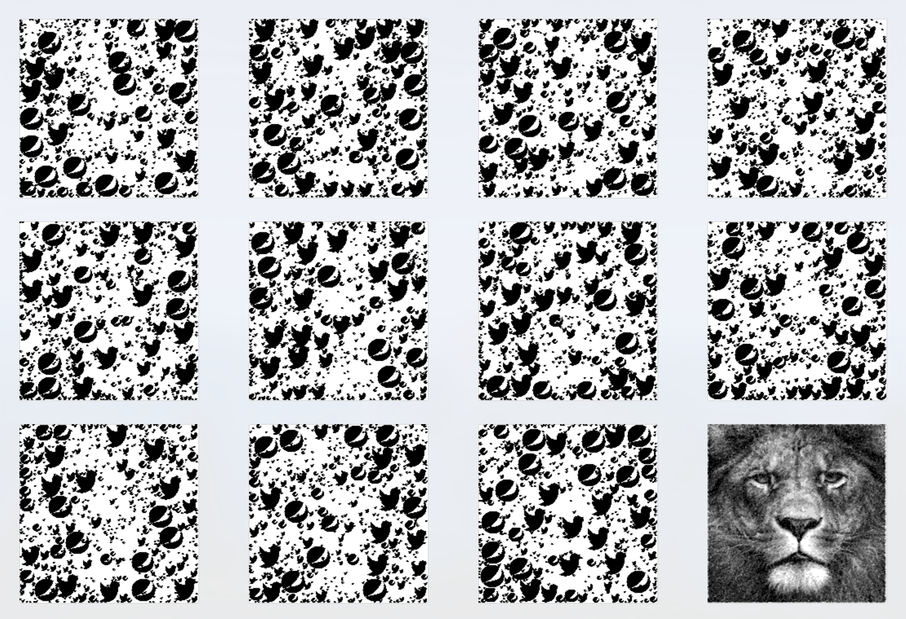
Much of the time, another result of this variation is that the shapes overlap one another less on each layer, so they are more distinct. Although it is not guaranteed, the result often looks like the shapes are packed, or even tiled, rather than randomly arranged on each layer. This is a different "look" to the layers, and may be more desirable, particularly when the shapes are recognizable structures like letters or even company logos. Figure 10 shows an example of our test image using the defragmenting variation. Compare the layers to those in Figure 8.
Another way to search is to skip building the available_pixels data structure, and instead search each layer independently to see if it can accommodate the box being tested. This search can be accelerated by building and using a sum table for each layer, of course. Then we can choose the layers based on some criterion regarding the shapes that are drawn. For example, we might first choose the layer that has the largest 4-connected shape resulting from trying to draw the rectangle, then the layer with the next-largest such shape, and so on.
A different direction is to remove our restriction that every layer be printed with only one shade of ink. If we allow the shapes to be printed with multiple shades, then their appearance can become more complex, or incorporate anti-aliasing on edges, which may be desirable in some circumstances.
To accommodate this, we can change uses_left from an integer to a floating-point value. Then we can write into each pixel of each layer as much ink as that pixel still has available, and remove just that much from uses_left.
We can also support color images with very little additional effort. A simple way to proceed is to process the color channels with independent sets of layers. Using any convenient color model, we could allocate a minimum of $G-1$ layers to each primary. Each group of layers would be printed with its corresponding ink to produce the desired perceived color.
This approach is simple, but it increases the number of layers in the sculpture by the number of primaries in the color system. This can have practical implications, ranging from mechanical assembly issues, loss of light energy (since no physical medium is entirely transparent), and a requirement for increased perspective correction (discussed more below). If these issues become significant, we could reduce the number of layers for some or all color components, adopt a different color model, or use different strategies, such as dithering, or even printing a variety of colors on each layer.
Other Shapes
So far we have only considered boxes as our basic drawing elements (in fact, we've considered only axis-aligned bounding boxes, or those whose sides are parallel to the sides of the original input image). Let's now see how to more general shapes.
Circles are straightforward, requiring only a little more computation. Returning to the original listing in Algorithm 3, we can treat the upper-left and lower-right corners given by ulx, uly, lrx, and lry as the corners of a bounding box that contains the circle. Then we merely need to replace line 14 to read,
14. foreach pixel in the circle, check uses_left. If all values are > 0
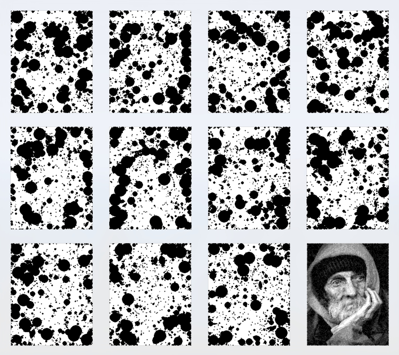
Figures 11 and 12 shows an example of an image using circles, without fragmentation reduction. Figure 13 shows the same image but with defragmentation enabled.
In fact, we can use any shape at all: raster images, vector images, procedural shapes, etc. We need only to be able to categorize each pixel in the shape's bounding box as being either on or off. There are no restrictions on the nature of the shapes: they can have multiple disconnected pieces, for example, or contain multiple holes. We can also consider transformations to those shapes, such as rotations, skews, affine transformations, warps, or any other transformation or deformation. If we want to include transformations that are more easily hand-drawn, then we can simply draw them as we like and provide them all in a convenient format (e.g., as raster images or vector shapes), and use them all simultaneously in our calculations.
We can also use any number of shapes in our building process. If multiple shapes can be drawn at a given pixel, or multiple variations on the same shape (e.g., rotations or other transformations), then we can choose among them with any policy we like. For example, we can pick the one with the most number of pixels, or the one that is the most connected to the other shapes already present, or has the maximum separation from them.
To illustrate this kind of generality, Figures 14 and 15 shows an example using a pair of corporate logos.
Binary Images
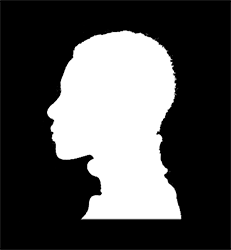
We've been using grayscale input images, but we can lower the number of grays to its minimum. Figures 16 and 17 show an example of a black-and-white silhouette processed with our technique. This has only two levels of gray, black and white, so it requires only one layer. However, as we saw earlier, that layer would immediately give away the final image, as its pixel values would largely match the image itself (in fact, since there's only one level of gray, the image could be printed with fully opaque black ink). By using more than one layer, the elements are diffused, and the underlying image is no longer perceptible in these multiple, sparser layers.
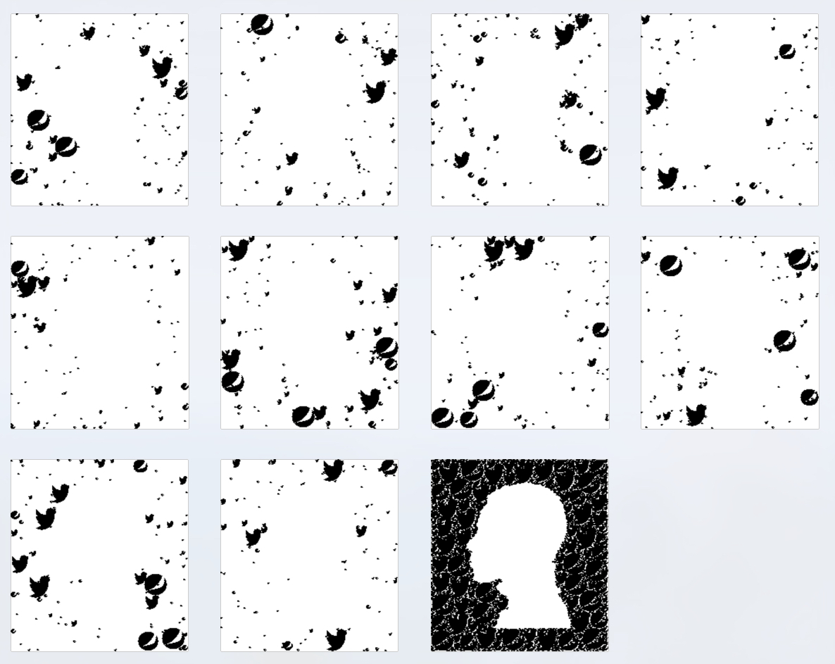
We earlier discussed how uses_left can have non-zero entries at the end of the layer-making process, and these entries characterize the degree of mis-match between the input and perceived images. An example of this mis-match is easily seen in the white spaces between the logos in the perceived image in the bottom right of Figure 17. This mis-match is a result of our choices to approximate the input image using shapes that might leave gaps between instances, and to impose a minimum size on those shapes. We could eliminate the problem by tightening up these choices, for example by requiring that we use only shapes that perfectly tile the plane [Grunbaum86].
In practice, we have not needed to take such measures. Usually the discrepancy appears as a small amount of noise that is relatively small in magnitude and generally evenly distributed, so that it has an effect similar to that of grain noise in a photograph. Figures 12, 13, and 15 include this kind of noise (as do most of the other figures that show different ways of constructing layers), and we find it makes no practical impact on the perceived image. When the mis-match is visible, as in Figure 17, it usually creates a texture that we find aesthetically pleasing. As we noted earlier, if we remove the minimum size on our shapes, then we can eliminate these noise and/or texture effects.
Other Variations
We can use the variety of shapes to enhance the images printed on the layers. For example, we could try to use larger shapes in dark areas, and smaller shapes in light areas, or vice-versa. We can use any kind of criteria to select the types of shapes we want at each point on the image. We can even provide this information explicitly, in the form of one or more images. For example, we might provide a grayscale image (in addition to the input image), where the brightness of the new image tells the algorithm what size of circle to prefer at that point. Or we could interpret black to mean we prefer a box at that point, and white to mean we prefer a circle, with intermediate values expressing intermediate preferences. We could even use such an image (or several of them) to control many shapes. For example, we could specify that corporate logos should appear near the border of an image, circles in the upper half, and silhouettes of employees in the lower half.
For example, Figure 18 shows an input image, and Figure 19 shows a set of layers where the larger shapes are circles, and smaller shapes are rectangles.
Another type of variation is to explicitly introduce structures into one or more layers. For example, suppose our source image is of a couple getting married. We might reserve the frontmost layer for the initials of the couple, placed as large as possible. The remaining shapes would then appear on other layers. Or a company's logo could be placed prominently by itself on the first layer, as large as possible.
Or we can build structure procedurally. Rather than seek the boxes with the largest area, we might seek boxes with the most extreme aspect ratios. That is, we prefer boxes that are long and thin, either vertically or horizontally. Then we could place the vertical boxes on the even-numbered layers, and the horizontal boxes on the odd-numbered layers, creating the impression of two different families of stripes. Figures 20 and 21 show an example of this variation.
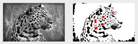
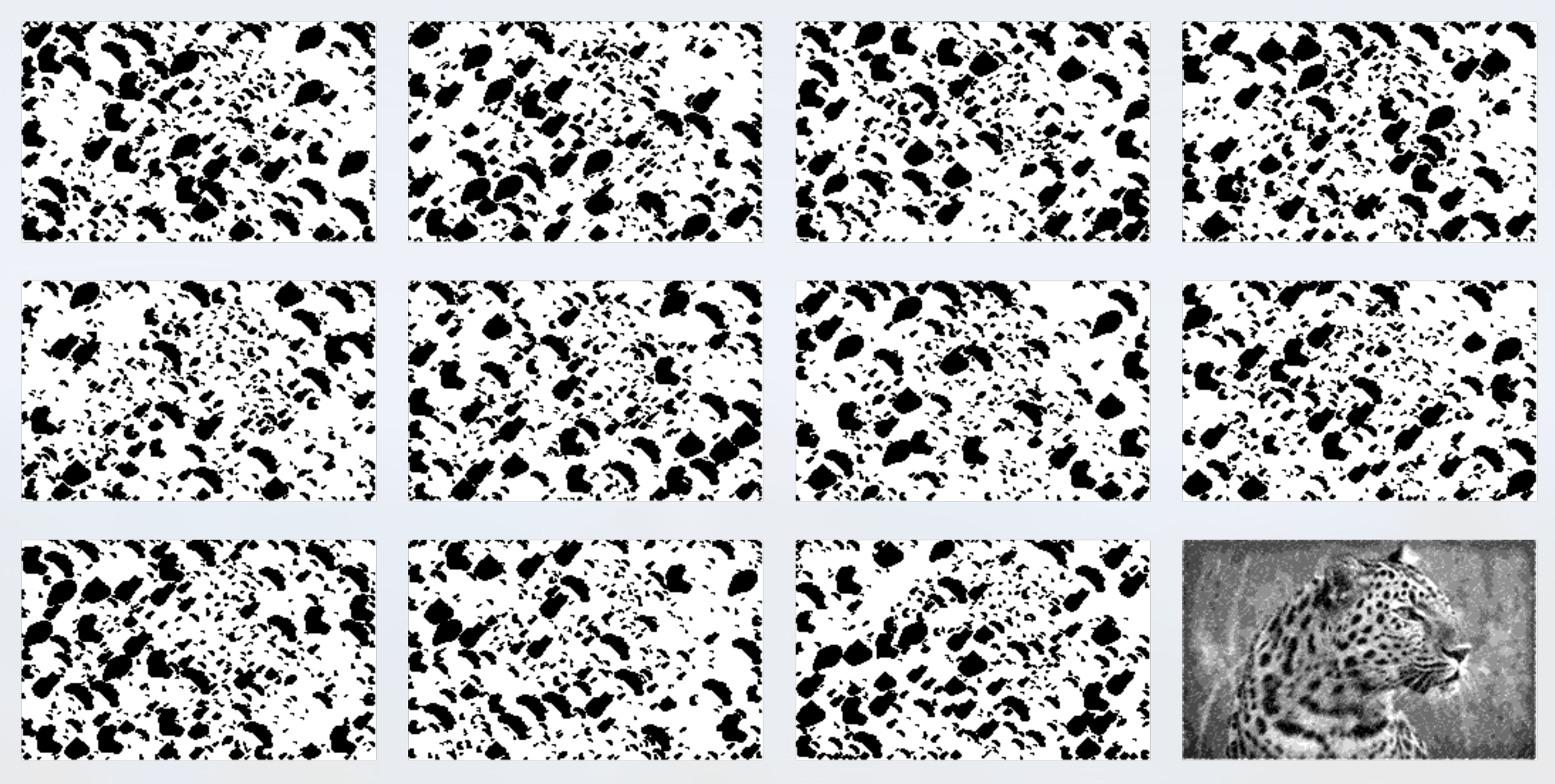
Another fun variation is to use elements from the source image to create the perceived image. Figures 22 and 23 show an example of this, creating a perceived image of a leopard using only its own spots.
Other Building Strategies
Our criterion for choosing a shape was based on it having the largest area, but we could also choose a much more random process. For example, the main loop might begin with choosing a random pixel in the input image, and a random shape at a random size and orientation. If the shape can be drawn, we do so. Otherwise, we could perturb these choices by small or large amounts, trying many different combinations in hopes of finding one that can be drawn. If we do find a shape that can be drawn, or we exhaust the number of possibilities we're willing to try, and there are pixels still left to be considered (or re-considered), we select one of those pixels and try again.
We can also invert our search strategy, searching first for the place we'd like most to place a shape, and then searching among the shapes for the best fit (perhaps taking into account different transformations and deformations that could be applied). This would allow us to create specific kinds of structure on the layers (e.g., a circle of densely-packed shapes on a transparent background, or a large version of a company logo isolated on the first layer, or even spelling out the letters of someone's name).
Algorithm 3 and its basic variations follow a sequential strategy: at each step we find the next shape to be added, we merge it into the layers, and repeat. This is also called a "greedy" strategy, since it makes the best choice at each step, using the information available at that moment. That is, it makes a locally optimal choice, hoping that will lead to a global optimum.
An entirely different approach uses explicit optimization techniques. We could pick a random location on the input image, along with a random shape at a random size and orientation, and then minimize (or maximize) some scoring function to try to find a set of values that maximizes some property (such as number of pixels covered), or minimizes some other property (such as number of holes, or incompletely filled pixels, in the perceived image).
We can take optimization farther. Suppose we start with an input image, and a large collection of shapes (perhaps even all the shapes in the sculpture), each with a position, size, orientation. transformations or distortions, and other defining parameters. Then we again use optimization methods to maximize or minimize some cost function, but now we're potentially manipulating the entire collection of shapes simultaneously, trying to find a complete configuration that best satisfies our criteria. The optimization literature offers an enormous wealth of strategies for implementing this approach, each of which may have its own characteristic look.
Another option that starts with a pre-built collection of shapes is to find a distribution of them that comes closest to a packing, such that the shapes do not overlap and do not leaves gaps. Then those shapes that should not be drawn are removed, and new shapes introduced to accommodate any decrease in the fidelity of the perceived image caused by their loss.
We can also vary the scoring function in any version of the algorithm. Our discussions have referred to each object's shape and size, but we can also measure the impact that each object has on the result. So we could prefer to say that the "best" object at each step is the one that best minimizes the distance between the input and perceived images. In other words, we choose the shape (and its size, orientation, etc.) which makes the best contribution towards making the perceived image match the input image.
Transparency and Opacity
I promised earlier to return to the assumption that more layers would cause darker perceived pixels. This is a valid assumption, but it does not mean that the opacities of the layers is additive. That is, adding another layer of partially-transparent ink will reduce the amount of light that reaches the viewer along that path, but each layer will generally not diminish it by the same absolute amount.
In the following discussion, we will speak about both transparency and opacity. We will write these as values between 0 and 1. Both terms refer to the same idea, but from different points of view: opacity refers to how much light is blocked from passing, and transparency refers to how much light is allowed to pass. The two values always sum to 1 for any given object being described. So if we say a region of a layer is 25% transparent (or has a transparency value of .25), then it is 75% opaque (or has an opacity value of .75), both of which mean that 25 percent of the incoming light is passed through, or 75 percent is blocked.
The Effect of Stacking Sheets
To see how opacities combine, consider a sheet of plastic that is 50% opaque; that is, it has an opacity of .5 (thus it has a transparency of 1-.5, or also .5). That means it allows half of the light striking its rear surface to exit from the front. If we were to look at the world through such a sheet, everything would look half as bright as it would without the sheet.
Now consider a sandwich of two sheets of .5 opacity each. The first removes half of the light that arrives from its back, so half of the light is passed through, and the second sheet removes half of that light, so the light that emerges from the front is 25%, or one-quarter, as bright as it would appear if viewed directly.
Adding a third sheet reduces this brightness again by half, so we'd see a scene one-eighth, or 12.5%, as bright as without the sheets.
This pattern continues: each new sheet reduces the light passing through it by half. So each new sheet removes a percentage of the light reaching it, rather than a fixed amount of light. The result is an exponential curve, of the form $a^x$ for an opacity of $a$ after $x$ layers. Figure 24 shows this phenomenon graphically. We suppose that the light from the scene has a brightness of 1, and we plot the amount of light that reaches our eye for different numbers of layers of equal opacity. Each additional layer makes the result darker, but by a smaller absolute value than the one before.
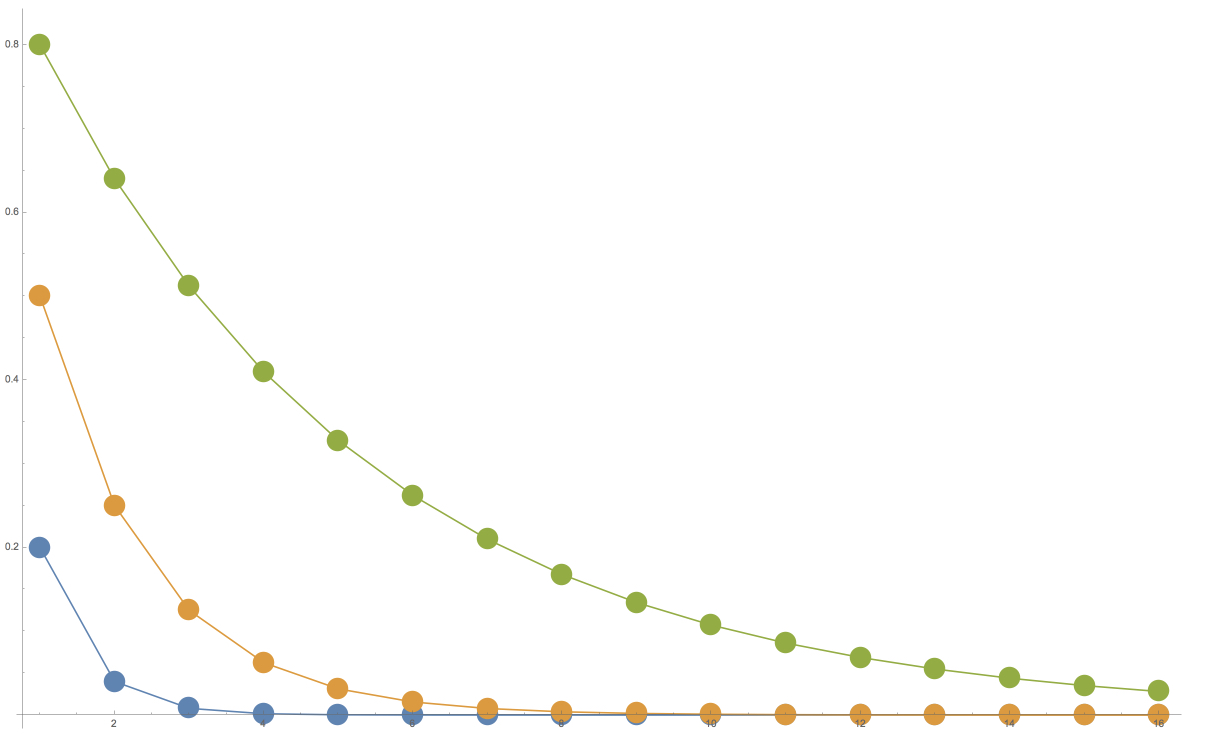
One result of this phenomenon is that if we use lightly transparent layers, we need to use very many of them to approach true black, or the absence of light (even ignoring other issues like ambient light). But as we'll see next, even getting down to a dark gray, which isn't too hard, is often good enough.
The Colors We See
The human visual system is a vastly complex combination of physical and perceptual mechanisms that help us interpret the light that reaches our eyes. One such mechanism is perceptual constancy. Speaking broadly, this describes the sensation familiar to us all that an object will seem to appear about the same even in different (though roughly similar) lighting conditions. For example, a favorite coffee mug on your kitchen counter will still look like the same favorite mug under bright morning sunlight, late afternoon haze, and even when illuminated by the glow of a television in the next room, even though the light reaching our eyes is very different in each case.
In short, when we expect something (or some aspect of something) to be "white", our visual system adapts so that we perceive white. The same goes for black. So if we're looking at a black and white image, and we know it's supposed to represent the whole range from bright white to deepest black, our visual system has a great ability to help us perceive it in just this way.
Of course, this phenomenon has its limits, and is dependent on many factors. We've all seen washed-out black and white photos with almost no contrast; we surely aren't seeing deep black and bright whites in those. But we do have a surprisingly strong and broad ability to perceive what we expect, regardless of the actual quantitative measurement of the light striking our eyes.
This is, in part, why this project works despite the fact that we can't get down to true black, as discussed in the last section. Generally speaking, our perceptual system will help us perceive the lightest shade we can see as "white", and the darkest shade as "black".
Another property of the visual system helps compensate for the non-uniform spacing of gray values produced by stacking up partly transparent sheets. The human visual system is not uniform in its response to light. Under many well-lit situations, we are more sensitive to differences between dark values than light ones. So although the intensities produced by the process above are more closely-spaced towards the dark end of the range, our natural ability to discern those differences more strongly works in our favor, and serves as partial compensation. Our perceptions depend on a tremendous number of personal and environmental factors, but even a little bit helps to smooth out the perceived distribution of gray values. We've found in practice that this non-uniform spacing of gray values has not been a problem, as viewers generally have no trouble understanding and interpreting the perceived image.
Correcting Colors
If in a particular application the issues of white, black, and non-uniform spacing become a problem, there are easy ways to work around them, at the cost of compromising some of our original design goals.
One most straightforward approach is to print the different layers with different opacities of ink. This would require adjusting the algorithm to correctly determine which layer (or layers) need to be painted to achieve a desired shade of gray.
Another approach is to use different opacities at different places on one more layers. Taken to its extreme, we could simply print the entire input image on one layer, though this would in effect mean printing the perceived image, which would subvert one of our key design criteria.
A different approach to addressing the non-linearity of Figure 24 is to build a correction into the original posterization. Earlier we spoke of taking an input with 256 shades of gray, and partitioning it into 4 equal ranges of 64 shades each. But we can use a non-linear partitioning instead. So rather than having four regions of 64 shades each, they could each have a different width. In this way we can redistribute the apparent darkness of the pixels, which could lead to a more uniform-appearing perceived image.
Perspective
Until now we've ignored perspective. When the viewer looks down through the sculpture, those layers that are further away will appear to be smaller, thanks to the well-known laws of perspective. If the sheets are thin and pressed together, the effect is likely to be small enough to be negligible. But when they're spaced out, perspective becomes an issue.
To account for perspective, we need to know the spacing between the sheets and the position of the viewer. This gives us the trigonometry we need to calculate the size each sheet needs to be, based on its distance, so that all the sheets appear to line up perfectly. Figure 25 shows the idea.
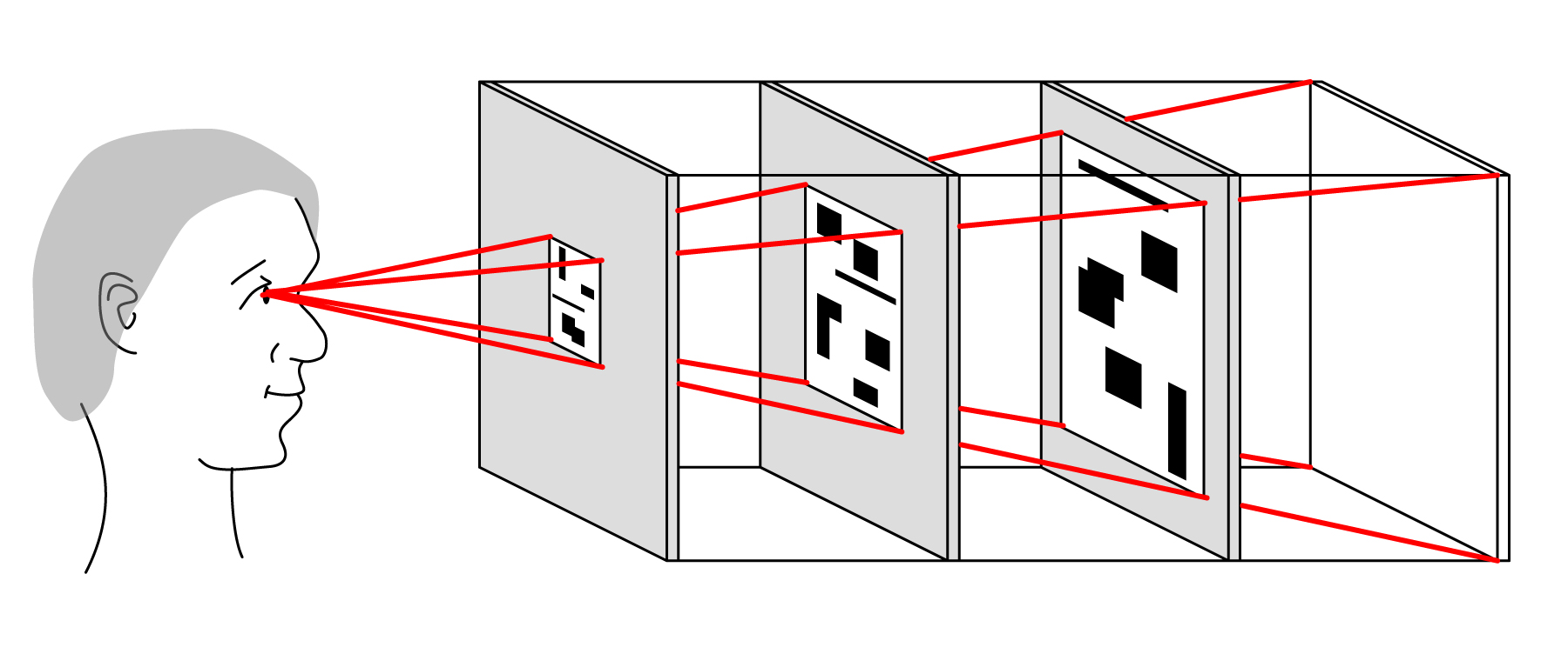
To compensate for perspective, the images on the nearer layers need to be smaller than the farther ones. This can be achieved in many ways, ranging from processing by the computer before the layers are printed, on the printer during printing, or even using another device that can generate a new image larger or smaller than an original (such as a photographic enlarger). If the sculpture uses a technology that can show different images on the layers (an LCD, for example), then the image can simply be re-sized immediately prior to display, or even re-sized in the display hardware itself (for instance, the active part of the display itself might occupy a physically smaller footprint).
Animation
We can display animation in our sculpture by presenting a time-dependent series of images on some or all of the layers. This may be done mechanically (e.g., changing the layers with a mechanism similar to a flipbook or mutoscope), or electronically (e.g., using LCDs for the layers).
If we don't care about frame-to-frame coherence, we could simply run our choice of algorithm once for each frame, and then display the frames in succession.
If we choose to create a smaller number of frames and interpolate, we can create in-between frames in many different ways. If we retain construction information for each frame, then we can form pairs of corresponding shapes in each frame, and even each layer, and then transform each starting shape into its ending shape. This could use any kind of shape transformation that looks appealing, ranging from rigid transformations to entirely free-form deformations. Shapes can move and change along the same layer, or they could even move and change between layers.
For example, imagine a 48-frame cyclic sequence of an animated horse. On any given layer, we may have a collection of circles of different sizes. Over the course of the animation, each circle follows a circular path of fixed radius from a given center. The circle travels one full orbit in the time it takes to run through one cycle of the animation. Each shape on each layer can have its own motion path. Thus, viewed from the side, we'd see shapes moving around on the layers, each on its own path, but again we would not know what the perceived image is at any time unless we viewed down the stack.
The motions of the shapes can have their own structure. For example, each layer may look like a kaleidoscope, or it may possess any other kind of static or time-varying symmetry. Or the shapes could follow any other types of structure, such as all moving as though connected together in a giant spiral which is itself rotating and changing in growth. We can build layers with any kind of static and dynamic patterns we like, as long as the underlying input image (or input animation) allows it. Finding these shapes and paths can require significant computing power.
An alternative is to map corresponding pixels, and let them migrate from their starting positions to their ending positions. If all frames don't have the same number of pixels, some pixels in the more-populated frames could be doubled (or tripled, etc.) and each pixel could then have its own trajectory.
Alternative Sculpture Construction
We have discussed the sculpture as a series of spaced layers with a lit white card at the back. The viewer typically approaches from side, and then finds the idea viewing position by looking through the layers and moving his or her head, bringing the image more and more into recognizability until he or she finds the idea spot, and understands the perceived image. There are many variations.
The card or the light source could be colored. For example, if the light is white and the card is sepia, this would produce a sepia-toned perceived image, like the kind we associate with early photography.
We have always discussed the layers as being held parallel to one another at a repeating fixed distance, but that was just for convenience when describing the algorithm. With a small bit of additional programming to compensate, the layers may be built in any orientation relative to one another, and the distance from one layer to the next may vary, or even be different for each pair of layers. If the layers can be changed over time, they could move into new positions and orientations between successive images, or even move while any single perceived image remains essentially unchanged. There may be visible artifacts in the perceived image due to the changing apparent shape and alignment of pixels as the layers move. This can be mitigated by using high-resolution panels, keeping motions small and slow, and other techniques to improve image coherence over time. Any remaining non-alignment artifacts may appear as a small amount of fringing or blurring; careful choice of the input image can help disguise these effects as part of the image's inherent structure, or even a normal artifact of photographic images such as noise due to grain effects.
The viewer's ideal location can be marked, such as with a physical viewing ring suspended or supported at a particular location. If the ring contains a lens, then perspective corrections built into the sculpture could be reduced. Alternatively, the viewer could be given the lens to hold freely as they move their head (perhaps it is hanging by a string from above, or is presented on a nearby table). Then the viewer would move his or her head as before, but while wearing or holding the lens, so they're enjoying both the free-form discovery process and layers with little to no built-in perspective correction.
At the other extreme, the viewer could be given the chance to manipulate the sculpture directly. It could be supported on a joint that allows it to rotate and/or move, or the sculpture itself could be free-standing, simply sitting on a table for viewers to pick up, hold in their hands, and move in any way they please.
The white card could be replaced by a light-emitting screen, removing the need for an external light source. If the light is strong enough (perhaps with the help of one or more lenses), we could provide another surface at some distance from the frontmost sheet (again, a lens could help here). This would serve like the screen in a movie theater, receiving the image (here the light emitted by the screen, as filtered by the sheets) and reflecting that back to the viewer, as in Figure 26.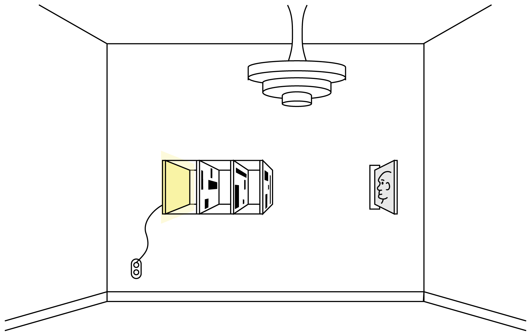
Another variation is to build the sculpture in a way that invites the viewer to look down the sheets from a considerable distance away. The farther the viewer is located, the less perspective correction is required, and so the images can be be produced (or displayed) so that they all have a similar size.
Finally, we note that although our illustrations have all used rectangular images ultimately composed of rectangular pixels, that is by no means required. The images may have any shape, and their image components may also have any shape: triangle, hexagonal, etc. They could even be aperiodic tilings, where no two "pixels" have the same shape. With appropriate programming, we don't need pixels at all, and could work directly with a vector or procedural input image, and produce vector or procedural output. This could be rasterized when printed, but many devices exist which can directly print from non-raster shape descriptions such as vectors and procedural shapes.
Another type of presentation does not use the stack approach. Instead, we mount each layer on its own stand, illuminated by its own light source, with all layers directed towards a common screen. In effect, the objects drawn on the layers cast shadows on the screen, and the shadows combine naturally. In this format, we may wish to use fully opaque ink for each layer. Figure 27 shows a diagram of this setup.
When preparing images for this type of display, we must use some basic trigonometry to compensate for the off-angle projections. This "keystoning" phenomenon is familiar to anyone who's presented a talk using a projector located only a few feet from the screen. When the layers have been adjusted this way, all of their boundary rectangles will overlap simultaneously, and the contents will superimpose correctly as well.
Another way to display the layers is to print them on silk or another transparent fabric, and then hang the fabrics one behind the other. It might be easiest to stretch them taut, mimicking the flat plastic sheets in the discussion above. But if we want them to hang naturally, we can first hang the fabrics to determine how they wish to hang, fold, and otherwise deform. Then we can warp and distort the layer images accordingly, so that when they are printed and the fabrics re-hung the same way, we get the image we started with. One would have to use care to get the fabrics to re-hang as they did before being printed. If the audience's only view of this setup was to look through all the fabrics at once, they would lose some of the fun of experiencing the patterns on the layers. But an alternative and appealing tension can still be created if the fabrics are hung to create a sense of depth, as the different apparent depths of the layers would usually conflict with the structure of the perceived image, creating something like the dissonance we get from first viewing the layers from the side.
Implementation
Our implementation is based roughly on the sequential method outlined in Algorithm 3, using the acceleration techniques described immediately after the listing. Our implementation is written in Python 3.4, using the Numpy scientific computing library.
The heart of the implementation is a class we call a Finder. Each instance of the Finder class implements one type of shape. For example, there's an instance for boxes, another for circles, and another for collections of raster images (actually, these are all implemented as derived classes that use Finder as their superclass, but we will discuss them here as though they were Finder objects). We will also refer to the Shape_data class, which contains information describing a shape (e.g., its bounding box, number of occupied pixels, any transformation or distortion information, and shape-dependent parameters such as the radius of a circle, or number of sides of a polygon).
A Finder implements four methods:
- init(uses_left): Given the uses_left array discussed above, build and return an instance of this Finder. The method will typically create a variety of additional internal data structures, held in instance variables, to help it do its job.
- get_next_shape(): This returns a new object, contained in an instance of Shape_data. It's the job of this method to implement a policy for selecting shapes (e.g., find the one with the largest area, or most number of filled pixels). It is also the method's responsibility to make sure that the shape is valid (that is, every pixel in the shape is not yet filled in on at least one layer).
- get_bitmap(shape_data): Given the shape_data. returned by get_next_shape, return a bitmap the size of the input image. The bitmap is 0 everywhere except where the shape should be drawn, where it is is 1.
- update(uses_left, shape_data): This method takes care of any updating that needs to happen as a result of drawing the shape in shape_data, as returned by get_next_shape. This would include updating any internal data structures, such as acceleration structures. The method also receives a new version of uses_left that reflects the new availability of pixels on the layers as a result of drawing that shape.
To help Finder objects do their work, we provide a general-purpose 2D object called a Cell_grid. This breaks the area of the input image into a grid of smaller rectangles. Each pixel in each rectangle holds a data structure that identifies the best shape that can be drawn in a bounding box using that pixel as the upper-left corner, and a score that describes how "good" that shape is (remember that "best" and "good" are determined by the policies we build into the Finder object).
So the initializer for a Finder will typically create a Cell_grid, and then populate it with the best shape and score for every pixel. When we call get_next_shape, that method will then ask the Cell_grid for the shape that has the best score, and it returns that in a Shape_data object. When we later call update, it determines a bounding box for the shape that was just drawn, as well as a bounding box that encloses all pixels whose shapes might have be affected by the changes to the layers as a result of drawing that shape. It hands those two boxes to the Cell_grid object, along with a callback procedure for evaluating pixels, and the grid takes care of determining which pixels need to be re-evaluated. For each such pixel it invokes the callback procedure to get the new data.
The main loop of the system reads the input image, initializes the data structures to hold the layers, and builds uses_left. It then starts working its way through a list of Finder objects. For each such object, it simply repeatedly asks for a shape, draws it into the layers data structure by taking the layers in the chosen sequence, updates uses_left, and asks for another shape. When we don't get back another shape (e.g., because no more can be drawn, or the largest one available is too small), the main loop moves on to the next Finder in the list and continues from there.
Each time a shape is returned, the program draws it into the layers using one of the algorithms described above (we typically use either the method that considers the layers in random order, or the method that sequences the layers according to how many pixels can be drawn). When the final Finder has no more shapes available, we write the layers to output files in a lossless format (usually PNG), and exit.
This architecture makes it easy to support new shapes by simply writing new Finder objects.
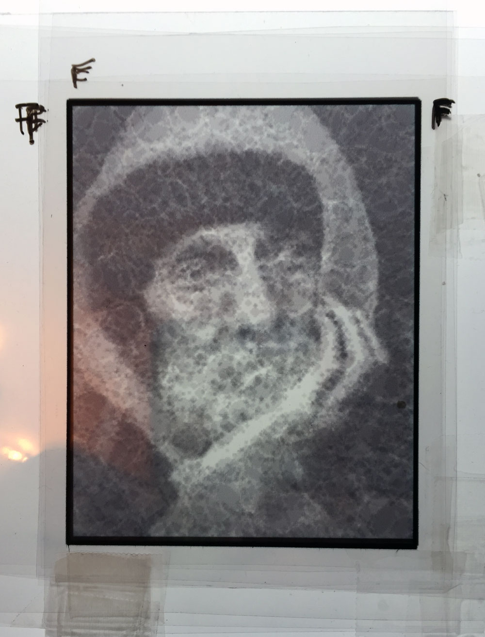
Figure 28 shows photographs of the layers of Figure 13 printed on .004 mil pre-treated/wet-media transparent polymer film with a Hewlett-Packard Photosmart 7520 inkjet printer and Hewlett-Packard 564 XL inks, with each layer set to an opacity of 30%. Each layer was photographed on top of a page of typical white copy paper. They were printed with no perspective correction, so they're all the same size and must be viewed spaced closely together. I simply cut the layers apart and taped them together in arbitrary order. Each layer is only about 2.75" by 3.5", so manual alignment was a bit of a challenge. The result is shown in Figure 29, photographed over a sheet of standard white copy paper using room lighting. We are encouraged by this result: the ribbing in his hat and the hairs in his beard are both easily visible. But we want to try a variety of other opacities and print materials. We have found that inkjet toner smears easily on polymer film, creating smudges, which makes working with the layers very difficult. We are looking for a more robust combination of printing surfaces, mounting substrates, and inks.
Other Applications
We have presented our algorithm in the context of artistic expression, but it is common that techniques invented for one purpose may be used for another, and that's the case here as well.
Consider the box-based image of Figure 8. We note that boxes can be represented with a very small amount of data (such as the $(x,y)$ co-ordinates of two diagonal corners). So we could use this technique to save on the bandwidth required to send an image, by sending just a subset of the boxes generated for Figure 8.
Even better, we can send boxes in the order in which they were constructed, offering progressive refinement. The first perceived images would appear coarse and blocky, but they would get get more detailed over time, as in Figure 9.
We can see that Figure 9 is typical of such progressive refinement schemes: the initial few bundles of data yield a big impact, while the following bundles make small changes as they clean up details.
Of course, there is no reason to restrict ourselves to boxes, or to a monochrome image. We've discussed above how the technique is amenable to different shapes and colored images.
A variation on this application is to score elements not on size, but on how well they work together to capture the high-contrast content, or edges, in an image. These areas of high contrast are often important visually, and can help us grasp the contents of an image. We could prioritize the shapes that communicate this information, and fill in the smoother, more uniform regions later.
We have phrased this discussion in terms of an input image, but even that is not necessary. All we really need is some way to evaluate how many layers should be painted at each pixel. This could be a completely algorithmic process, driven by any data source (e.g., voting patterns, weather data, demographic distributions, etc.). In cases such as this, the perceived image might not appear to be a photographic image at all, but rather a visualization of the underlying data. This visualization may be concrete or very abstract.
The technique may also be used for applications where security and privacy are an issue. For example, someone in an airport might be engaged in a video chat with their family. They might not want every passer-by to see their family members, their home, etc. If they are using this technique (in one of its time-varying versions), then anyone nearby who can see the layers would only see apparently random shapes. The composite, perceived image would only be visible to the person making the call, whose eyes are in the just the right spot to align the layers.
More practically, we could consider a class of encrypted secrets which can only be decrypted if all members of a group agree, or perhaps only if a majority agrees. The secret could be encoded into an image (perhaps as text or a diagram, or as a compressed image like a QR code), and converted into as many layers as there are members of the group. Depending on the image, it would only be legible if more than some fraction (perhaps all) of the members cooperated to superimpose their layers.
Conclusions
We have presented the structure of a family of algorithms for creating an image-based sculpture. The layers of the sculpture appear to be painted with shapes that are random, or that have their own structure, but which don't reveal the input image from which they were derived. The layers are transparent, and printed with semi-transparent ink. When a viewer looks through all the layers simultaneously, the opacities of the layers combine, and the viewer beholds a perceived image, which may be grayscale or even color.
We've looked closely at one particular type of implementation, but we've seen that a wide family or methods may be used to create a variety of artistic effects.
References
[Crow84] Crow, F.C., "Summed-area Tables For Texture Mapping" Computer Graphics (Proc. SIGGRAPH 84), ACM Press, New York, vol. 18, no. 3, 1984
[Glassner02] Glassner, A., "Getting the Picture", IEEE Computer Graphics & Applications, Sept/Oct 2002, pp. 76-85
[Grunbaum86] Grunbaum, B. and Shephard, G. C., Tilings and Patterns, W.H. Freeman and Company, August 1986
[Haeberli90] Haeberli, P, "Paint by Numbers: Abstract Image Representations," Computer Graphics (Proc. SIGGRAPH 90), ACM Press, New York, vol. 24, no. 4, 1990
[Peterson65] Peterson, H.P., "Digital Mona Lisa: A Computer Masterpiece," http://www.digitalmonalisa.com/tech_info.html